Gerade eben bin ich mit dem Fahrrad die Kastanienallee Richtung Rosenthaler Platz gefahren. Auf der rechten Seite kam mir eine Schrift irgendwie bekannt vor. Das Schild mit der darauf befindlichen Schrift hing über dem Eingang zu einem Biergarten namens Prater Garten. Die dazugehörige Schrift identifizierte ich als FF Prater. Warum Schrift und Biergarten den gleichen Namen tragen, kann man hier nachlesen.
Lars
Posts mit dem Label Typespotter werden angezeigt. Alle Posts anzeigen
Montag, 20. Juni 2011
Prater Garten | Berlins ältester Biergarten
Donnerstag, 9. Juni 2011
Typespotter: FF Liant
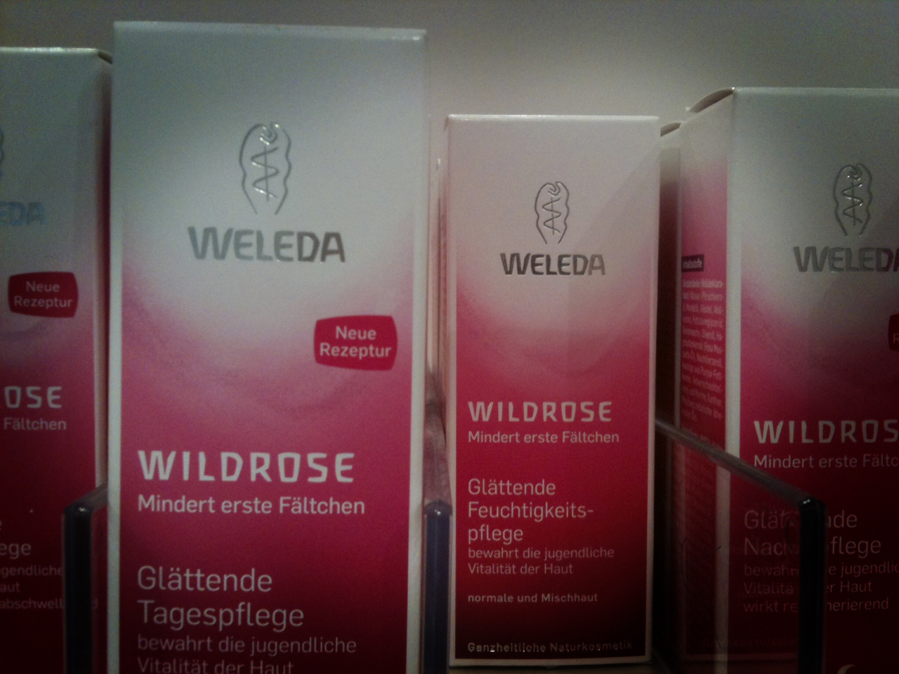
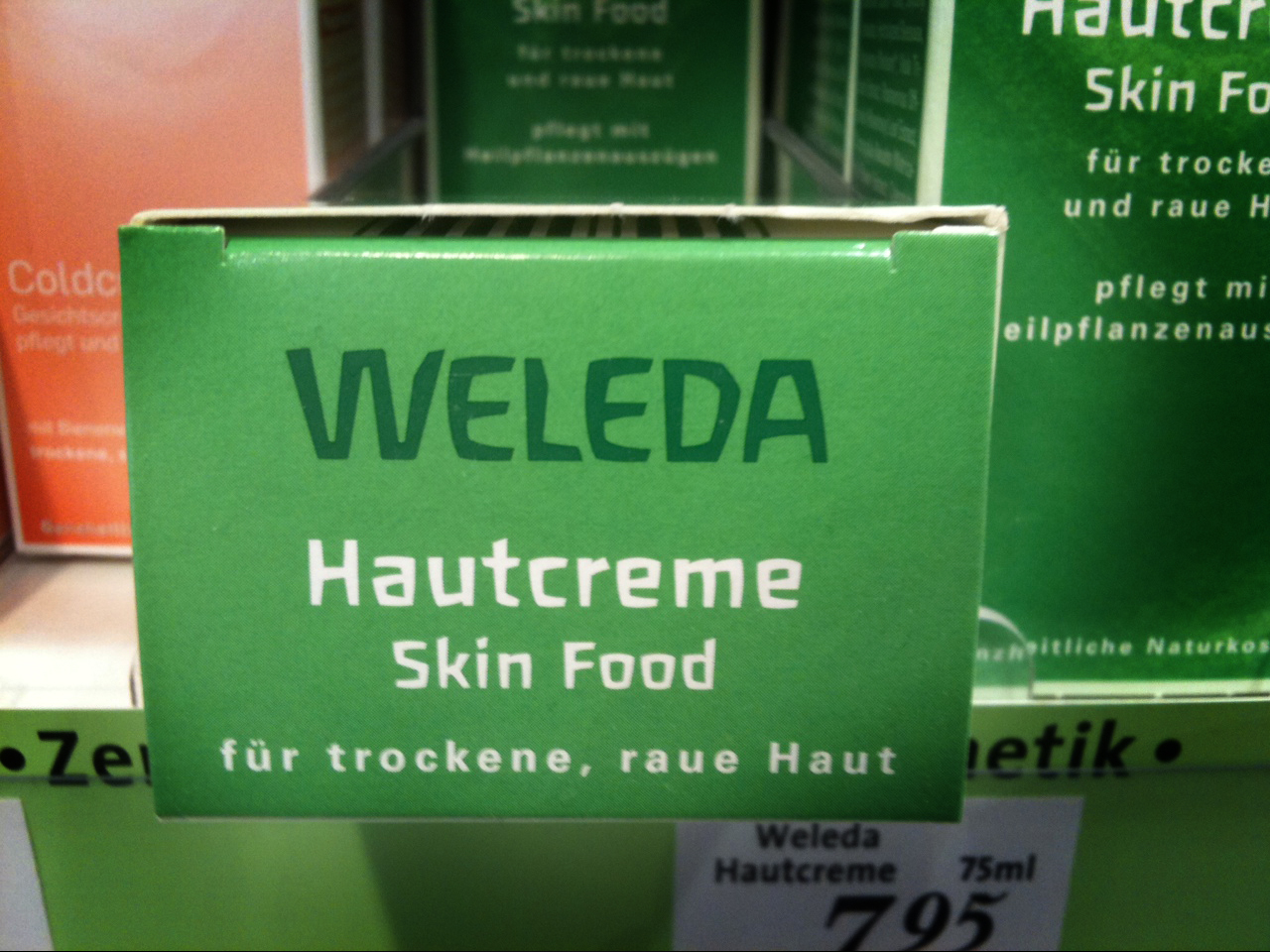
Letztes Mal waren wir in der Backabteilung. Heute befinden wir uns in der Drogerie. Auf der Suche nach einer Tagescreme kommt man heutzutage wohl kaum an den Produkten von Weleda vorbei. Neben der tollen Verpackungsgestaltung überzeugt Weleda mit einer – meiner Meinung nach – für den Verwendungszweck sehr überzeigenden Schrift. Ist ja auch kein Wunder, denn die Schrift wurde 1976 extra für die Weleda AG Deutschland gezeichnet. Im Jahre 1995 wurde die Schrift bei FontShop International veröffentlicht und hört seitdem auf den Namen FF Liant. Designer dieser unverwechselbaren Type ist Ingrid Liche.
Lars
Beschreibung FontFont: »In 1976 Ingrid Liche began designing Liant Medium for the packaging of the natural cosmetic company Weleda AG in Germany. Since then this face has defined the corporate identity of Weleda worldwide and because of this company’s prestige, the look to the entire natural cosmetic and biologically oriented industry. Because of a split of opinions in the international company in 1994, the mother company in Switzerland decided to introduce a new house face; thereby giving up the brand name recognition that had been established over twenty years... Because of the turn in events and since Liche still owned the rights to Liant, she decided to distribute the face exclusively over FontShop International. She re-digitized the font, adding several ligatures and expanding the face to a three weight family. The most noticable characteristic of the font is its lively lines, the forms for which are taken from nature. Within the individual characters there is an exchange of sinking and rising points, which are connected by taut curves.«
Lars
Beschreibung FontFont: »In 1976 Ingrid Liche began designing Liant Medium for the packaging of the natural cosmetic company Weleda AG in Germany. Since then this face has defined the corporate identity of Weleda worldwide and because of this company’s prestige, the look to the entire natural cosmetic and biologically oriented industry. Because of a split of opinions in the international company in 1994, the mother company in Switzerland decided to introduce a new house face; thereby giving up the brand name recognition that had been established over twenty years... Because of the turn in events and since Liche still owned the rights to Liant, she decided to distribute the face exclusively over FontShop International. She re-digitized the font, adding several ligatures and expanding the face to a three weight family. The most noticable characteristic of the font is its lively lines, the forms for which are taken from nature. Within the individual characters there is an exchange of sinking and rising points, which are connected by taut curves.«
Freitag, 27. Mai 2011
Typespotter: FF Cocon
Dem Bild zu urteilen könnte man denken, dass ich jenen Kuchen besonders lecker fand und euch dieses Rezept nun weiterreichen will – dem ist nicht so, denn gekauft habe ich diese Backmischung nicht. Gestern im Supermarkt (architektonisch betrachtet sah der Supermarkt doch eher wie ein Konsum aus) kamen mir Buchstaben des Wortes »Käsekuchen« auf der mittleren Verpackung äußerst bekannt vor. Meine Augen hatten mich nicht betrogen – es war die Schrift FF Cocon von Evert Bloemsma aus dem Jahre 2001.
Beschreibung FontFont: »We all know the small spurs of the lowercase letters a, b, d, g, h, m, n, p, q, r and u. They are relics of the hand-written word where a round form is attached to a straight line. Bloemsma decided to find out what the result would be if they were left off; this proved a difficult starting point for a typeface. Beginning with the lower case a, he drew a family of rounded yet rather asymmetrical forms with details reminiscent of brush-strokes. The individual letters rather neutral, but as a group make FF Cocon a typeface of spirit and character.«
Und wer jetzt noch nicht genug hat klickt hier.
Lars
Beschreibung FontFont: »We all know the small spurs of the lowercase letters a, b, d, g, h, m, n, p, q, r and u. They are relics of the hand-written word where a round form is attached to a straight line. Bloemsma decided to find out what the result would be if they were left off; this proved a difficult starting point for a typeface. Beginning with the lower case a, he drew a family of rounded yet rather asymmetrical forms with details reminiscent of brush-strokes. The individual letters rather neutral, but as a group make FF Cocon a typeface of spirit and character.«
Und wer jetzt noch nicht genug hat klickt hier.
Lars
Abonnieren
Posts (Atom)