Auf ghostarmy.de ist ein gerade fertiggestelltes Projekt von zu sehen: das Hilfeforum der FontShop AG Berlin. (Lars)
Mittwoch, 31. August 2011
Neues Projekt | FAQ Fontshop
Neuer Soldat bei Ghostarmy: Sam Anvari, Los Angeles
Demnächst wird ein neuer Söldner GHOSTARMY beitreten. Der unerschrockene: Sam Anvari aus Los Angeles. Mehr zu seiner Person demnächst.
Soon a new mercenary will join the GHOSTARMY. The intrepid soldier: Sam Anvari from LA.
Soon a new mercenary will join the GHOSTARMY. The intrepid soldier: Sam Anvari from LA.
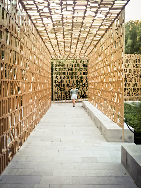
Christlicher Garten | Garten der Welt | Berlin, Marzahn
Man glaubt es kaum. Mitten in Marzahn gibt es einen Fleck der wirklich schön ist: der Garten der Welt. Damals berichtete der Fontblog ausführlich über die Entstehung und Gestaltung des Teilbereichs Christlichen Garten. (Lars)
Gutachter bescheinigen S-Bahn professionelle Arbeit
Na, herzlichen Glückwunsch, liebe Deutsche Bahn! Schon erschreckend, dass erst ein Gutachter kommen muss um euch professionelle Arbeit zu bescheinigen. (Lars)
Dienstag, 9. August 2011
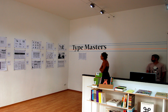
Type Masters
Dan Reynolds war so großzügig für uns über die Type Masters-Ausstellung in der Mota Italic Gallery zu schreiben. Ganz großen Dank dafür an ihn für den großartigen Beitrag!
»Type Masters is the second exhibition at the Mota Italic Gallery, Schliemannstraße 34. It runs from July 26 through August 27, 2011. Brief displays of 24 new typefaces are displayed, designed by most of the students from the 2011 masters classes of the Department of Typography and Graphic Communication at the University of Reading (UK) and the type]media course at Koninklijke Academie van Beeldende Kunsten in the The Haugue (NL). Each included typefaces is presented in a black and white A3 specimen, created by the respective designer. These specimen are hung by typeface name, in alphabetical order. For each typeface, the designers also provided a 140-character-long description.
The exhibition opening on Thursday, July 28, was well-attended; over 100 Berlin-based designers were counted. Until August 27, Type Maters is open daily – except Sundays and Mondays. There is a small preview of the exhibited works on the Mota Italic Gallery website, as well as a good bit of information about it typeface and its designer. The gallery printed a small, folded brochure for the exhibition repeating some of the information, with thumbnail images of the included typefaces.
For their previous exhibition, Capital: Berliner Buchstaben, Mota Italic produced a small book. My favorite part of this catalog (which is still available for sale) is the introductory essay by Jan Middendorp, explaining the growth of the Berlin type design scene in recent decades. This exhibition is also one that would have benefited from an accompanying text by Jan. In his book Dutch Type (2004), Jan already wrote extensively about type design instruction at KABK. An independent survey of work designed in Reading during the last decade has not yet been written. I would be interested on an independent article discussing type design education at KABK and the University of Reading today. This exhibition – the first joint showing of student work from both programs – would have been an appropriate opportunity to publish thoughts in this direction. I find Type Masters to be a great gesture. Before now, none of the MATD typefaces from their class of 2011 had been seen. Although this could well be because their course does not end until September, whereas type]media 2011 finished up a few weeks ago. Still, the KABK typefaces are already pretty well known, thanks to their class website and printed specimen.
This exhibition means a lot to me. I studied on the MATD Reading, and I have a number of friends and colleagues from both programs. Plus, having known both Rob and Sonja Keller for years, I'm pleased to be so impressed with the success their their firm Mota Italic – as well as its new gallery –has had to date.
All of the collateral for the exhibition has been set in the Capitolium typeface, by Gerard Unger. This is quite appropriate, as Gerard is probably the only type designer to regularly instruct at both institutions.«
alle Bilder © Dan Renolds
Abonnieren
Kommentare (Atom)


